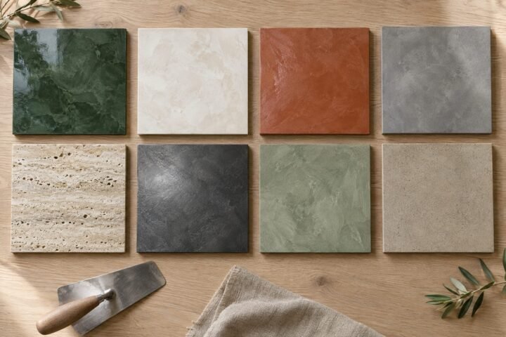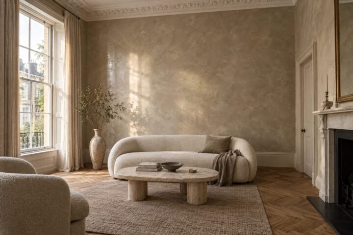
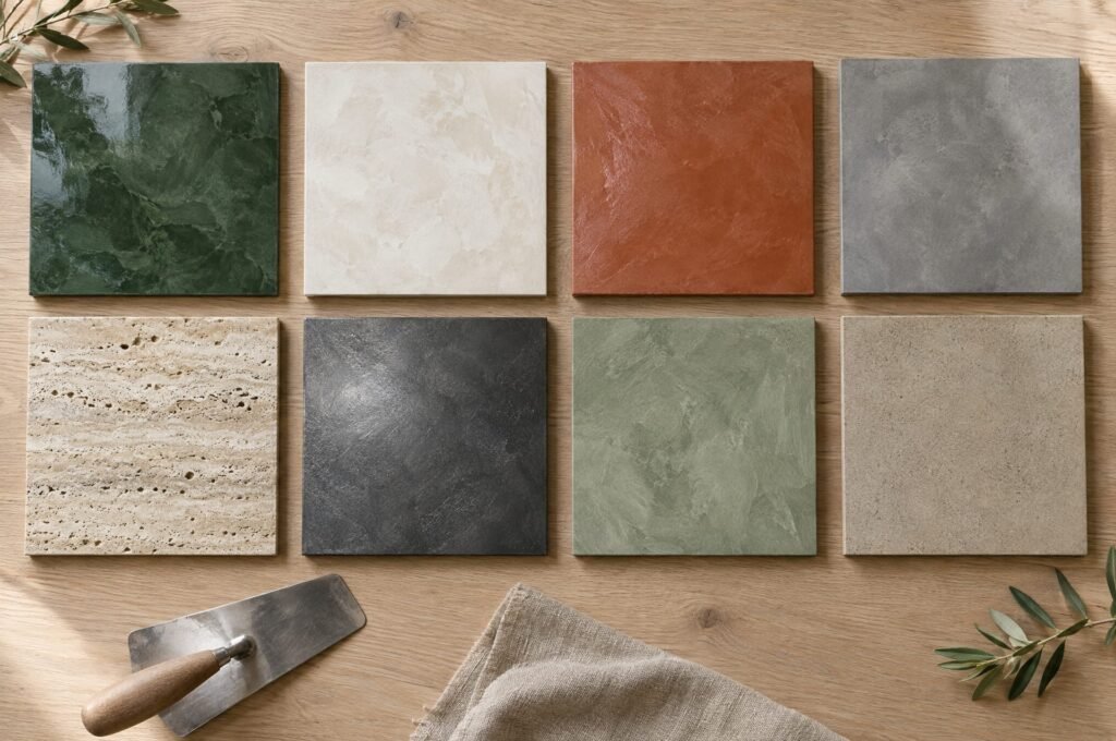
Colour in polished plaster behaves differently from paint. It has depth, movement and variation, and it changes with the sheen you choose and the light in your room. Here are ten shades we love for London homes in 2026 — and how to make each one work.
Before you choose: the same pigment reads softer and lighter in matt Marmorino, and deeper and richer in high-gloss stucco veneziano. Always judge colour on a real sample board, in the actual room, at different times of day.
1. Warm bone
A soft, creamy off-white with a hint of warmth — far more interesting than brilliant white. In Marmorino, it gives hallways and stairwells a calm, gallery-like feel; in satin polished plaster, it glows gently in the evening. Perfect for period homes, where it flatters cornicing and joinery.
2. Greige stone
The quintessential Venetian plaster colour: a warm grey-beige that looks like natural limestone. It works almost anywhere — living rooms, bedrooms, open-plan spaces — and pairs beautifully with oak floors, linen and brass.
3. Mushroom and taupe
A little deeper and earthier than greige, with a soft brown undertone. Mushroom tones feel cocooning in bedrooms and snugs, and they’re forgiving in north-facing London rooms that can make cooler greys feel cold.
4. Clay and terracotta
Earthy reds and baked-clay oranges continue to be one of the strongest interior trends. In tadelakt, terracotta is spectacular in a wet room; on a living-room wall in satin plaster, it brings Mediterranean warmth even on a grey February afternoon.
5. Sage
A soft, grey-green that feels natural and restful. Sage looks lovely in a matt finish or lime wash in kitchens, garden rooms and bedrooms, especially with natural timber and plenty of plants.
6. Olive
Deeper and warmer than sage, olive has an earthy sophistication that works beautifully in studies, dining rooms and hallways. It looks particularly rich in a satin polish.
7. Forest green
A deep, saturated green that comes alive in high-gloss stucco veneziano — think a dining room or library glowing under lamplight. It’s a bold choice, but polished plaster’s depth stops dark colours from feeling flat or heavy.
8. Chocolate and espresso
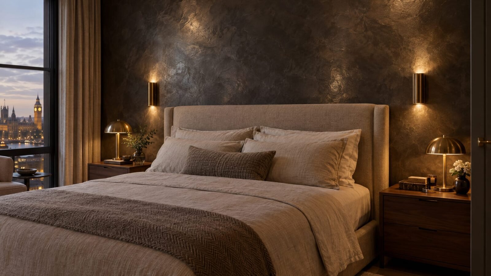
Rich browns have made a confident comeback. In a polished finish, chocolate tones feel luxurious and enveloping — ideal for a snug, a home bar, a powder room or behind a bed. Pair with cream textiles, warm brass and soft, low lighting.
9. Smoky blue and slate
A muted, grey-blue that feels calm and tailored. It works well in bedrooms, bathrooms (outside the splash zone) and studies, and it’s lovely in south-facing rooms where warm light balances its coolness.
10. Charcoal with metallic shimmer
For drama, few finishes beat a deep charcoal with a subtle metallic or pearlescent glaze. It shifts from soft grey by day to a gentle shimmer by lamplight. Brilliant behind a bed, in a cinema room or in a hotel corridor — see our metallic and textured finishes.
How to choose the right colour
- Look at the light. North-facing rooms (common in London terraces) give cool, even light — warmer colours help. South-facing rooms can take cooler tones.
- Consider the sheen. High gloss deepens and enriches colour; matt softens and lightens it. Read Marmorino vs stucco veneziano.
- Think about the whole room. Floors, joinery, fabrics and metal finishes all affect how a colour reads.
- Go bolder in small rooms. Powder rooms, studies and hallways are the perfect place to experiment.
- Use samples generously. Hold boards against each wall, morning and evening, before deciding.
Colour in commercial spaces
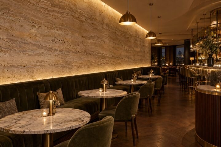
In restaurants, bars and hotels, colour sets the mood: warm clays and chocolate browns for intimacy, soft stones and bone for calm, metallics for evening drama. We work with designers to create bespoke colours and sample panels — see polished plaster in commercial interiors.
See the colours in person
Screens can’t do polished plaster justice. Browse our finishes and samples, read what Venetian plaster is, then book a free survey — we’ll bring sample boards in the colours you’re considering, anywhere in London and the Home Counties.

We apply Venetian plaster, Marmorino, tadelakt and microcement across London and the Home Counties. More about us · Get a free quote